“Eavesdropping,” 6×8″ oil on linen panel (Gatorboard).
I finally had enough, it’s done, it’s done!
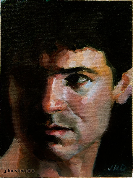
This is another painting from my “novela” series (which I explain better at the bottom of this post), where I explore emotions in more depth. I always enjoy doing these paintings—so many expressions to capture! Totally love it.
I fussed with this painting for a while (you can read more of my struggles here) and decided it’s time to let it go. Time to move on to another painting! Even with the frustrating moments, I still enjoyed painting this one very much.
This painting was also my first attempt at painting on a New Traditions Art Panel, which is a bit ooh la-la and high end (too good for me! Ha!) but I had to try them out. (I’m such an art materials junkie!) I liked the lightness and sturdiness of the Gatorboard (which is like a super stable foam board with an unbendable quality) and the linen was very smooth, but somehow it seemed to suck in the paint. A bit weird to paint with. I think there are probably other linens from New Traditions that I’ll like better. (And if I don’t, oh well, I still have RayMar and Sourcetek!)
This is a little different from some of my other recent paintings. But it’s a “guilty pleasure.”
“Ginger Cowboy” is from a series of art I’ve done for years. Somewhat campy, romanticized, corny (if you will) portraits of cowboys inspired by my childhood love for TV westerns. (I loved—and still love—those old reruns like “Wagon Train,” “Maverick,” “The Big Valley” and on and on!).
This was painted with no reference, no model, no photo, just from my imagination, which explains why he looks a little different from some of my other work. When I paint these cowboys, they are a compilation of every handsome TV cowboy that I loved since childhood!
Cowboy Plate, earthenware with commercial underglazes, on wheel-thrown plate.
Here’s a plate I made years ago, during my ceramics phase (which I hope to return to very soon!). I’m very fond of “my” cowboys. They’ve been my fond companions for a very long time.
I’ve been a busy, busy bee, painting and painting and painting!
This post is the story of two profile paintings, and learning when to stop, or in other words, am I quitting too soon? Or going too far? I am still learning and don’t always get it right.
The other day I started a painting, got it sort of “done,” and posted it on Facebook. I got some compliments. But I didn’t think I was done! So I did some more to it. And then even more. And I do NOT think it’s improved. I should have quit while I was ahead.
So tonight, I did a little oil sketch and “quit while I was ahead.” Maybe I’ll have to find a few dabs here and there to touch up, but I very much hope that there won’t be much more to add to it.
Blue Shadows, 6×8″ oil on panel
Thanks to hermitmessiah on DeviantArt for the use of the stock photo. I found the reference photo so fascinating because of the strong color shifts, and wanted to try to capture warm/cool temperatures in the blues and greens in the shadows and reflected light, as well as the muted flesh tones. Also loved the overall pose and expression.
Here’s the painting from the other day that I should have also quit while I was ahead, but didn’t.
Eavesdropping, 6×8″ oil on linen panel.
There’s a little more I need to do; it’s probably not “ruined” (at least I hope not) but I should have just stopped earlier.
The problem was, it didn’t look enough like the reference photo, and while it doesn’t have to be an exact likeness (I was going for a feel, and expression, not the likeness per se), I wanted the likeness a little better! I mourn the loss of the original version, which was fresher and simpler, but didn’t look like the guy in the photo at all.
This painting is part of my “novela” series, which I find great fun, so many wonderful expressions and emotions to explore!
Again I use a “favorite” model, Jason Aaron Baca. (Photo reference credit: Photographer Portia Shao positivevista.com – Model: Jason Aaron Baca jasonaaronbaca.deviantart.com) Mr. Baca has a plethora of stock photos on DeviantArt, available for artists to use as reference. So often his photos are fraught with drama and imagination, so I have used his stock several times and plan to use more!
With this photo, it was a photo of his figure (I think waist-up) but I found the expression on his face so arresting, as well as the dramatic lighting, that I thought I could make something of it. Really enjoyed working on this one.
Painted on an oil-primed panel by RayMar. (Love my Raymar panels!)
I’ve mentioned the Zorn Palette before. It’s a limited painting palette that consists of four colors: White, Black, Vermillion (Orangey-red) and Yellow Ochre. It’s incredible how many colors can be achieved with just these four paints! The background on this painting “looks” blue, but it’s just black and white mixed together. (Black is often a bit cool, which will create the illusion of a muted blue.) The purple in the shadow side of her face is a mixture of white, black, and vermillion. Mixing colors was so fun for this painting!
Here’s another recent example of the Zorn palette in action. (Scroll down the page to see the second painting.)
Again I used a stock photo for reference. Thanks go to shewarmachine.
Many thanks to Mehlissa who made her stock photo available for artists to use as reference.
I found this photo a few years ago, and finally got around to using it! I enjoyed trying to analyze the shadows and cool muted tones in her skin and attempting to capture them with paint. In a way this painting was a major breakthrough for me, as I’ve been trying to push my understanding of color and brushwork.
I painted on Gessobord, by Ampersand, a wonderful type of artists’ panel that is primed with an acrylic-based “gesso” that has the texture of eggshell. It’s an absolutely sublime surface to paint on, for either oils or acrylics! With this painting, I used oils.
“Mercy” miniature painting, 4×4 inches, oil on Gessobord
First, I’ve been toying with the thought of using a limited palette of White, Sap Green, and Alizarin Crimson (Permanent). One of my favorite artists, John Larriva, has been playing with variations of this palette for a while, and that inspired me!
Mercy converted to B&W. Interesting! Click on image to see larger version.
Just because I felt like it, I also converted this image to B&W to see how it would look. It’s said that you can tell if the values of your painting are correct if it still looks okay in B&W. I think my painting passed the test (I hope?).
Anyway, about the limited palette: I used Liquitex Everwhite, Dick Blick’s Alizarin Crimson Permanent, and Williamsburg Sap Green. (More about the Everwhite later in this post! 🙂 )
I found the whole experience of limiting myself to just these colors, Sap Green, Alizarin Crimson Perm., and White, to be really challenging! I wasn’t sure I could do it at first. I desperately yearned for a yellow. But after a while, I got used to it and realized that it was starting to come together. It’s a bit like the Zorn Palette (see an example of that here) in that you have to think of warm and cool tones, and not so much about getting the right blue, yellow, or red. Mixing the green and the crimson together will make a pretty good dark (almost black) and it’s amazing how the flesh tones finally start to “click” after a while when you’re mixing. I’ll have to try this again sometime soon.
Okay, the other thing: Liquitex Everwhite! It’s no longer being made! An artist friend was showing me his collection of yard sale oil paints and it was the mother lode for a paint geek like me! Brand new, still in box, never used, Liquitex oil paint! I asked him if I could buy the large 150 mL tube of white, and he was willing. The tube was untouched, unused, and with a copyright date of 1980. And it was still as fresh and as buttery as it was all those decades ago! So I used it for today’s painting.
Squee! Over 34 years old! And still fresh and buttery!
This is a testimony to anyone who wonders—will my paint last? Yes, oil paint lasts for a long, long time. Occasionally you’ll have a paint mishap, where the tube gets a little hole in it or something, but assuming that the tube is sealed and undamaged, there’s no reason to worry about your paint drying out before its time. So stock up now if you can, and scour those garage sales!
Yep, another study from a stock photo I found on DeviantArt! This time it’s a fellow named This-is-RArt. I loved his blue dreadlocks.
Blue Dreads, 5×7″ oil on panel
I’m studying warm and cool tones, and how they relate to the portrait especially. After attending a workshop taught by Adam Clague, I have felt like something has “clicked” and I’m seeing things differently! It’s strange, because it’s not like I didn’t “see” before—I’ve been drawing and painting for a long time. Continue reading “Blue Dreads – oil on panel”→
I don’t know where that title comes from. I need a name for a painting, and this will do.
Exotic Simplicity, oil on panel, 8×8 inches
I must credit Cathleen Tarawhiti, whose photograph I used as reference. She makes some of her photos available for “stock,” as a reference for artists, and I’ve got quite a few of her photos stored on my iPad.
A few weeks ago I was hanging out with some artist friends and wanted something to paint, so I pulled up a photo on my iPad and started this little study. I did most of it in one night.
The original photo is of a figure, but thanks to my iPad’s capabilities, I was able to zoooooom in and just look at her face. Maybe someday I’ll do a painting based on the full figure.
Until recently I printed out photos to use as reference, but was encouraged by some friends to work from a computer monitor. That wasn’t convenient, so instead I use an iPad. It’s working out great! And I needed an excuse to indulge in an iPad.
There’s really no excuse for such a long absence from this blog. Other than I’ve been busy and that a lot of positive changes have happened!
I’ve been studying more, and was able to attend a workshop taught by a wonderful young artist, Adam Clague. I’ve also taken some private lessons with him. His instruction has helped me immeasurably and I’m so grateful to him!
And, I’ve been able to paint a lot more, and work from life a lot more. These are vitally important to an artist’s development.
And lastly, I got myself a new studio! It’s a mess, but was very much needed. One of my friends said that renting this studio has given me more confidence and “seriousness” about my art. I think she’s right.
Well, that’s enough of the updates. Here are a few paintings that I’ve done in the last few months:
“Green Ribbon in Her Hair” oil on panel, 8×8″.
I whine about this painting, but I’m glad it’s done. I was trying to apply many of the things I’ve learned under Adam Clague’s tutelage. I realize that there’s much more to learn. I had fun with this painting, using some Charvin brand paint (with a limited palette). I love all the variety of colors available from Charvin.
“Zorn Palette, Jason Aaron Baca” 5×7″ oil on gessobord.
I really enjoyed painting this little study. It was painted entirely with the “Zorn Palette,” a limited palette consisting of only: Vermillion Red (orange-red), Yellow Ochre, Black, and White.
The palette is inspired by Anders Zorn, who is getting a lot of attention from artists lately. (He recently had a big show in San Francisco.) In some of his paintings he focused so much on form and value, as well as temperature (“warm” vs. “cool” colors) that he could get by with just these four colors! The black paint is “cool” (almost blueish) and can substitute for a blue when needed.
You’ll see in the painting above the greenish tints in his 5-o’clock shadow, as well as the background color? All done with these four colors. I mixed the black and yellow together to get the green, and black and white gave me a “cool” grey (which can almost pass for a muted blue) which I used in the background.
The Zorn Palette is awesome. It helps the artist focus on values and shapes and brushwork, without agonizing too much over a myriad of color mixing choices. Sometimes, you don’t need any other colors other than the Zorn four (white, black, red, and yellow!).