I started this painting a while ago, and finally finished it! I love cats and have already painted a few, and plan to paint many more in the near future.
The amount of subtle colors in a white cat are astonishing! I had such a wonderful time trying to capture not only the colors, but the values (level of light and dark) as well. I started out by using a printout as my reference, but finished up by referring to a photo on my iPad. Wow, the colors showed differently. I had to wing it.
Thanks to sarahharas1 of DeviantArt for the fabulous reference photo.
I have “Tutorials” listed as a menu item in this blog, but I barely have any tutorials! So I thought I’d do a quick one on one of my favorite subjects: Art materials. I’ll cover some of my favorite products and give a few recommendations as well.
PAINT: Oil and Acrylics, which are better?
Some people who haven’t done a lot of painting get a little confused about which is “better,” oils or acrylics? The answer is, there really isn’t any “better,” these are different types of paints and will fulfill different needs.
Oils are my favorite, but that doesn’t mean I don’t like acrylics as well. I like oils because they’re so forgiving—mess up and you have time to fix it, wipe it off and blend it away . . . not as easy to do with acrylics.
Acrylics are great too, no fuss, just thin with water, easy to clean, don’t have to wait to dry! What’s not to love?
Each will appeal in their own way.
OIL PAINTS
Oil paint myths, or things you may have heard about oils that are not actually true.
They really don’t cost that much more. Oils are more dense (you can tell this when you pick up a tube, they are often heavier!). Less goes farther. That’s why tubes of acrylics are larger, to compensate for the relative ‘fluffiness’ they have compared to oils.
They are not so deadly toxic, so don’t be afraid of them! In some cases they are no more toxic than acrylics (depending on which pigments you choose). Cadmium is cadmium (toxic pigment that you don’t want to breathe in or ingest). It doesn’t matter if it’s cadmium in oils or acrylics, it’s still cadmium, right? Don’t assume that all acrylic colors are non-toxic and won’t hurt you. Check the health warning labels on both acrylic or oil colors to see what the risks are. (And remember, just because some of these pigments are classified as toxic, it doesn’t mean anyone who paints with them is immediately going to drop dead. Don’t bring food to your painting area, don’t breathe dried paint dust, wash your hands and change dirty clothes after painting: all these things reduce your risks significantly.)
It’s the solvent (thinner) you use, not the paint itself, that has more potential to be harmful. If you paint in oils but remain “solvent-free” (don’t use paint thinner, turpentine, mineral spirits) then basically all you’re breathing in is the oils (which for most people is not a problem) and whatever additives are in the paint, most which are not going to cause problems. You can get around painting with solvents by either thinning everything with an oil like linseed, safflower oil, etc., or using a non-toxic thinner like Weber Turpenoid Natural. (I use a lot of this stuff myself, but don’t mix it too heavily into my paints—mostly use it to clean my brushes between mixing colors.)
They don’t have to take forever to dry: I use an alkyd-based medium like Winsor & Newton Liquin which speeds up the drying time by a lot. Often my painting is dry to the touch after about 12-24 hours. If you paint thicker, the drying time will be longer, but not weeks and weeks!
You don’t always save money by buying student paint. It depends on which pigments you use, and where you go to shop. If you shop at your local Michael’s or other chain craft store, you might be paying almost as much for student grade paint as you could pay for artist grade through mail order. For example, wait until there’s a coupon or code and you can get some very nice cadmium colors for very affordable prices from Utrecht. Utrecht Oil colors, 37ml tube. I get a lot of my paints from Utrecht (always during a sale, always!). Many other brands of artist grade are on the “lower end range” (but still artist grade) and will do better for you (and be as cheap or cheaper) than student grade. Such brands include Lefranc & Bourgeois Artists’ Oils and Richeson Oils The Shiva Series. Wait for the sale, the discount coupon, something, and get a higher quality paint for a student grade price! (By the way, some friends have reported that some of the Utrecht colors “gum up” [start to dry] faster than other brands, so if you are concerned about that, either use some sort of covered palette [like this one, I love this one], or only place down enough paint for one or two days, so you don’t waste paint.)
Recommended oil colors (some of my favorites):
WHITE is the most important of all. If you can’t afford any other artist grade paint, at least get an artist grade white. Some nice quality whites are:
You can also choose the “Titanium White” variation on any of these brands (except Permalba, only get “Permalba White”). I just like the Titanium-Zinc mixtures best. Utrecht’s “Utrecht White” (Titanium-Zinc) is also good, but I was too lazy to put it on the list! Either Titanium-Zinc or Titanium will do you fine!
If you want to go up a little higher on the paint food chain, here are some pricier (but fabulous) whites:
What about other whites, like ones that contain lead?
I like lead white (aka Flemish White, Flake White, Cremnitz White). You don’t have to use them, but they are nice for portraits. Just take care, because you know, the lead thing. For an affordable (and in plentiful supply) lead white, I recommend Utrecht Flemish or Flake White (when on sale, the 150 mL tubes are very affordable!). You’ll have to do a quick search on Utrecht’s site for their Flemish or Flake whites.
OTHER OIL COLORS:
I spend so much time obsessing about white, I neglect the other colors! Here’s my current short list of favorite oil colors that are must-haves for my palette:
Permanent Alizarin Crimson: (Currently I’m using Blick’s Permanent Alizarin Crimson, but Winsor & Newton and Gamblin’s Alizarin Permanent are excellent too. By the way, the great Richard Schmid recommends the Winsor & Newton and Gamblin! So there you go!) BE SURE TO GET THE “PERMANENT” variant of Alizarin Crimson. The regular Alizarin Crimson will fade over time and is considered “fugitive.”
Cadmium Red Light: Right now my favorite is Holbein but many other brands are fine. Utrecht is also good. (Watch out for it gumming up early, but for the lower price, it’s worth the risk!) I’m also very partial to Blue Ridge Artist colors—very high quality, and surprisingly affordable prices for Cadmiums!
Yellow Ochre: Many brands are fine. I don’t have a strong preference in brand right now.
Cadmium Yellow Lemon (or Light): It’s got to be a cool, cool yellow. Lemon is best if you can get it. Right now I’m using Richeson Oils The Shiva Series brand, but again Utrecht’s version is good too.
Ultramarine Blue: There are so many good Ultramarines! Lefranc & Bourgeois is a good but affordable blue (anything that says “Ultramarine Blue” in it will work) but I admit that I find Blockx’s Ultramarines to be soooo fine!
“Bright Blue”, Prussian Blue or Phthalo Blue: Another richer, stronger blue. Both Prussian Blue and Phthalo are super-strong blues, a little goes a long way. They can easily overpower a mixture, but they are great for mixing blacks and other strong, dark colors. Most brands will do, because both Prussian and Phthalo are so strong that even the cheaper brands still pack a punch. Another variation that I like a lot is Utrecht’s Bright Blue. It’s a mix of Phthalo and Ultramarine and is a nice, nice blue. (You’ll have to do a bit of hunting on the Utrecht page to find Bright Blue, as I can’t seem to link to it directly.)
Transparent Red Oxide:Lefranc & Bourgeois has a good version of this, as well as Blockx’s Transparent Mars Red. Sublime! I consider Transparent Red Oxide as a must-have, even more important than other earths (like Burnt Sienna). They are great in mixtures as well as for tinting the entire canvas in preparation for starting a new painting.
Burnt Sienna, English Red, Mars Red or other “earth”: Most earth pigments are fairly affordable, so even the cheaper brands should be okay. But some are better than others! Blick Artists’ Oil Color have some good colors.
Save money, and learn color control by using limited palettes:
This works for both oils and acrylics.
If you are trying to trim down how many paints you use, or are afraid to invest in a lot of oil paints for fear you won’t like them, try a limited palette. The most obvious first choice is the Zorn Palette:
Painting done with Zorn Palette. (Thanks to Jason Aaron Baca and Portia Shao for the stock photo I used as reference!)
The Zorn Palette consists of only four pigments: White, Black, Vermillion, and Yellow Ochre. (Read more about it in this post.) There’s so many colors you can get from just these four colors. For doing a painting like the one I show above, I recommend a Cadmium Red Light (which is more vibrant and a bit “cooler” than other vermillions). An Ivory Black is “cooler” than other blacks, so that’s a good way to go.
Okay, that’s enough about oil paints for today!
Please note: I’m an “affiliate” with the online stores, whose links I give above. That means that I may get a small commission for any sale that results from visitors visiting these links. I shop at these stores all the time and would link to these stores regardless of whether I would get a commission or not! 🙂
I did some final tweaking to this painting and I think it’s done!
For some reason I had trouble with this; perhaps it’s still “not right,” but I believe in letting go eventually and moving on to the NEXT! So that’s what I will do with this.
Again I used a reference photo from Jason Aaron Baca (model) with photographer Portia Shao. I love his photos because there’s so much drama there. I love the drama! He’s so generous to make his stock photos available to artists.
With this pose there was a slight “searching” or “beseeching” expression on his face, which I enhanced. I did a few slight adjustments to his features (just to mix it up a little). I hope this will make for a somewhat arresting portrait.
Painted with oils on another Sourcetek (I think—or was it Raymar? I think it was Sourcetek) panel. I love the texture of these panels. I covered the entire panel with a thinned-down layer of Transparent Oxide Red, which I wiped away in some spots (to paint in the face and flesh tones) but I left much of the Oxide Red still there. I think it worked as the background.
Another painting done, and a couple others that haven’t been blogged about yet.
“Demure” oil on Sourcetek canvas panel, 8×8″.
And yet again, I used one of my favorite photographer’s work for reference. Thank you Cathleen Tarawhiti for the use of this stock photo!
I always feel I’m in the process of learning, and many times there is this feeling of uncertainty—did I get this right? Am I off the track. . . again? I guess all artists go through this to some extent.
It was fun to explore the cools and warms in this subject. I purposely left parts of it unfinished—that’s the fun of it! Let a bit of the canvas texture to show through!
Now onto another recent effort, still not done as I feel I must fuss with it some more.
“Roman Youth” 6×8″ oil on Sourcetek panel.
Many thanks to Jason Aaron Baca and Portia Shao for the stock photo I used as reference! Mr. Baca (the model) is another favorite of mine; I have quite a few of his photos on my iPad, ready to paint!
In this photo I am struggling with a few things, so it’s not quite done yet. I hope to finalize this little oil sketch in the next day or two.
The reference photo shows a fuller-length pose of Mr. Baca in some sort of Roman-style period costume, and him looking up, searchingly . . . I enhanced that expression (plus changed his features just a tiny bit—like to mix it up!) and came up with this. I want to tweak a few things a bit more and then I hope it’s done! And onto the next painting.
And both of these above paintings were painted on Sourcetek panels. I love, love, my Sourcetek! I’ve been doing some spring cleaning and have been finding hidden pockets of Sourcetek. Here, there, everywhere they are stashed! Those 5-packs of boards in various sizes and types (oil primed linen, acrylic-primed canvas, hardboard, birch, all types!). I had no idea that I’d bought so many! Well, it’s time to use them up!
And I forgot, one last painting from a few days ago:
“Piercing Gaze” 6×8″ oil on Sourcetek panel.
Yep, another Sourcetek panel, I believe! This time I used a stock photo by Stockingbird on DeviantArt. The original photo was a nude (crouched pose) but I couldn’t get past the face—the sublime warms and cools, the neutrals, they cried for attention. For this painting I used a Zorn Palette (which I’ve used before) which is an excellent way to get back on track with color. You only have black, white, vermillion (orangey-red) and black to work with. You mix all your colors with that. Adding black to colors can cool them down and you can create some good subdued blue-greys and greens with the addition of black. Another interesting experiment. It won’t be the last time I use the Zorn Palette!
“Eavesdropping,” 6×8″ oil on linen panel (Gatorboard).
I finally had enough, it’s done, it’s done!
This is another painting from my “novela” series (which I explain better at the bottom of this post), where I explore emotions in more depth. I always enjoy doing these paintings—so many expressions to capture! Totally love it.
I fussed with this painting for a while (you can read more of my struggles here) and decided it’s time to let it go. Time to move on to another painting! Even with the frustrating moments, I still enjoyed painting this one very much.
This painting was also my first attempt at painting on a New Traditions Art Panel, which is a bit ooh la-la and high end (too good for me! Ha!) but I had to try them out. (I’m such an art materials junkie!) I liked the lightness and sturdiness of the Gatorboard (which is like a super stable foam board with an unbendable quality) and the linen was very smooth, but somehow it seemed to suck in the paint. A bit weird to paint with. I think there are probably other linens from New Traditions that I’ll like better. (And if I don’t, oh well, I still have RayMar and Sourcetek!)
This is a little different from some of my other recent paintings. But it’s a “guilty pleasure.”
“Ginger Cowboy” is from a series of art I’ve done for years. Somewhat campy, romanticized, corny (if you will) portraits of cowboys inspired by my childhood love for TV westerns. (I loved—and still love—those old reruns like “Wagon Train,” “Maverick,” “The Big Valley” and on and on!).
This was painted with no reference, no model, no photo, just from my imagination, which explains why he looks a little different from some of my other work. When I paint these cowboys, they are a compilation of every handsome TV cowboy that I loved since childhood!
Cowboy Plate, earthenware with commercial underglazes, on wheel-thrown plate.
Here’s a plate I made years ago, during my ceramics phase (which I hope to return to very soon!). I’m very fond of “my” cowboys. They’ve been my fond companions for a very long time.
I’ve been a busy, busy bee, painting and painting and painting!
This post is the story of two profile paintings, and learning when to stop, or in other words, am I quitting too soon? Or going too far? I am still learning and don’t always get it right.
The other day I started a painting, got it sort of “done,” and posted it on Facebook. I got some compliments. But I didn’t think I was done! So I did some more to it. And then even more. And I do NOT think it’s improved. I should have quit while I was ahead.
So tonight, I did a little oil sketch and “quit while I was ahead.” Maybe I’ll have to find a few dabs here and there to touch up, but I very much hope that there won’t be much more to add to it.
Blue Shadows, 6×8″ oil on panel
Thanks to hermitmessiah on DeviantArt for the use of the stock photo. I found the reference photo so fascinating because of the strong color shifts, and wanted to try to capture warm/cool temperatures in the blues and greens in the shadows and reflected light, as well as the muted flesh tones. Also loved the overall pose and expression.
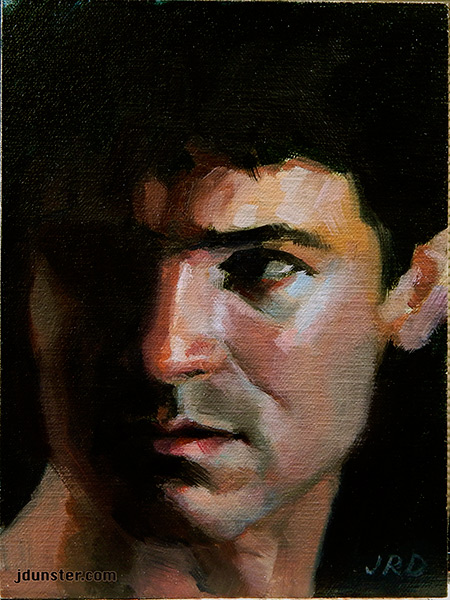
Here’s the painting from the other day that I should have also quit while I was ahead, but didn’t.
Eavesdropping, 6×8″ oil on linen panel.
There’s a little more I need to do; it’s probably not “ruined” (at least I hope not) but I should have just stopped earlier.
The problem was, it didn’t look enough like the reference photo, and while it doesn’t have to be an exact likeness (I was going for a feel, and expression, not the likeness per se), I wanted the likeness a little better! I mourn the loss of the original version, which was fresher and simpler, but didn’t look like the guy in the photo at all.
This painting is part of my “novela” series, which I find great fun, so many wonderful expressions and emotions to explore!
Again I use a “favorite” model, Jason Aaron Baca. (Photo reference credit: Photographer Portia Shao positivevista.com – Model: Jason Aaron Baca jasonaaronbaca.deviantart.com) Mr. Baca has a plethora of stock photos on DeviantArt, available for artists to use as reference. So often his photos are fraught with drama and imagination, so I have used his stock several times and plan to use more!
With this photo, it was a photo of his figure (I think waist-up) but I found the expression on his face so arresting, as well as the dramatic lighting, that I thought I could make something of it. Really enjoyed working on this one.
Painted on an oil-primed panel by RayMar. (Love my Raymar panels!)
I’ve mentioned the Zorn Palette before. It’s a limited painting palette that consists of four colors: White, Black, Vermillion (Orangey-red) and Yellow Ochre. It’s incredible how many colors can be achieved with just these four paints! The background on this painting “looks” blue, but it’s just black and white mixed together. (Black is often a bit cool, which will create the illusion of a muted blue.) The purple in the shadow side of her face is a mixture of white, black, and vermillion. Mixing colors was so fun for this painting!
Here’s another recent example of the Zorn palette in action. (Scroll down the page to see the second painting.)
Again I used a stock photo for reference. Thanks go to shewarmachine.
Many thanks to Mehlissa who made her stock photo available for artists to use as reference.
I found this photo a few years ago, and finally got around to using it! I enjoyed trying to analyze the shadows and cool muted tones in her skin and attempting to capture them with paint. In a way this painting was a major breakthrough for me, as I’ve been trying to push my understanding of color and brushwork.
I painted on Gessobord, by Ampersand, a wonderful type of artists’ panel that is primed with an acrylic-based “gesso” that has the texture of eggshell. It’s an absolutely sublime surface to paint on, for either oils or acrylics! With this painting, I used oils.