This is a bit of an experiment, something I’ve been meaning to do for a while.
I didn’t use a model or a reference photo for this painting, but instead made it up completely from my imagination. While this portrait is not that unique (I make up faces all the time, for fun), it’s not typical for me to do what I did with the color on this one. Instead of simply inventing the flesh tones, the lights, darks, pinks, greens, warms, cools, I consulted a photo (with a different pose, with a different person) just to “get” the color. Not sure I was completely successful, but I think it’s a worthy exercise and made me really think.
After studying with Adam Clague, I am taught to look for the warms and cools on an object, as well as value, and what color is it (blue? green? magenta? orange?). One of the “rules” is that if you have cool lights, you have warm shadow. If you have warm lights, you have cool shadows.
I applied this rule (as best as I could) and so this portrait has cool lights (flesh tones with a more magenta tint are “cooler” than flesh tones with a yellowish tint) and warm shadows (I used a lot of Transparent Red Oxide in the shadows). While this portrait is just getting me started, it was gratifying and fun to do it.
The title “Pretty Boy” refers to my penchant to draw pretty people when I am inventing faces. I guess this harks back to my childhood, and all the handsome TV heros I grew up with, and sketched in my sketchbook.
EDIT: Ah, such is the life of an artist. A crazy, crazy artist. I pulled an “all-nighter” in my studio and tweaked this painting. And tweaked it. (And constantly updated this page with a picture of each new tweak.) I’m not saying it’s better or worse now, just “different.” Oh boy.
“Orange Kitty Head,” 5×5″ oil on textured panel. Thanks to Lumibear on dA for the stock photo used as inspiration!
Another cat head! A supremely orange kitty! Look at those blue eyes. Orange cats are so fun to paint. I love their coloring. Alas, this is not a portrait of my kitty, since my orange kitties (embarrassed to admit that I must use the plural of “orange kitty”) are grumpy or too pale. Oh, who am I kidding? I will paint my own orange kitties in due time. They must earn their keep, right?
This kitty is a mighty fine orange kitty, with beautiful markings and vibrant color. A joy to paint.
This is a 5×5″ oil sketch done on a nice type of textured gessoed panel. It has a “canvas-esque” type texture, but is just gesso (acrylic ground). The panel is thick-ish (I believe 3/8″ thick) with a dovetail slot in the back (which means you can hang it as-is, or you can stick it in a frame).
“Lady with Hat,” 6×8″ oil on Gessobord. Thanks to swiftsugar of DeviantArt for the stock photo I used as inspiration!
I loved the expression and pose of this one. The original photo that I used as reference had an exaggerated “golden” tint to it, which I didn’t want to paint. So I ran the photo through my iPad photo editing app (not iPhoto) and chose an option that took away a lot of the yellow. Then I used the adjusted photo as my reference. It was an interesting little iPad tweak!
There were a lot of golds, greens, and muted oranges in this one. A different color scheme, but a lot of fun to paint! She has a very vintage look to her, her expression and the way her head is tilted.
I enjoyed painting this one, and now it’s time for the next!
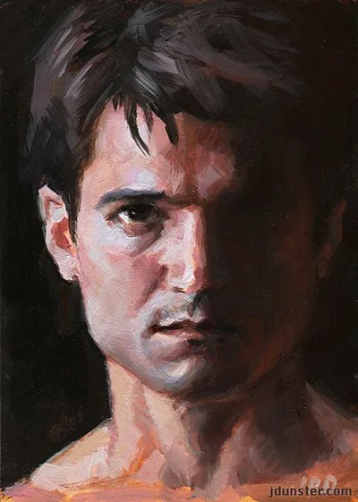
“Jason in Shadow” 5×7″ oil on Gessobord. Thanks to Jason Aaron Baca (model) and Portia Shao (photographer) for the stock photo I used as reference.
I classify this as oils, but to be more specific, I used fast-drying oils (alkyds) on this painting. They are one particular flavor of oils and have been around for a while. (Read more rambling from me about them on this post.)
I’m a big fan of Jason Aaron Baca’s stock photos on DeviantArt. So much drama! Dramatic poses, dramatic lighting, what’s not to love? So here’s another little oil sketch based on one of his photos.
With this painting I was working again with trying to capture the light and shadow, and of great interest to me, the warms and cools. He had a lot of cool tones in the highlighted parts of his face. I’m also working on making more pronounced brushstrokes, more strong and visible. I love bold brushwork and want to get more proficient with that! So exciting!
So, another one done. Put a fork in it! Now onto the next oil sketch. I have several in the works!
I forgot to post this painting earlier. It was completed in August. I loved the intense look on the model’s face, but when I compare my finished piece with the stock photo used as reference, I realize that it ended up being more “inspiration” than a literal reference. I changed the expression, the intensity, the contrast, a lot of things. Now don’t get me wrong, it’s still obviously painted from that particular photo, but the jawline, the shape of the head, and the tilt of the head, among other things, were all changed. I don’t consider it a good likeness of the model anymore. But I have no intention of changing it.
What attracted me to this particular stock photo was the expression of the model, as well as all the variety of colors in his face—the pinks, neutral greens, and even some pale lavenders. It was a challenge trying to capture all of that in the painting. Not sure I succeeded completely, but I tried!
I used Ampersand Gessobord this time, which has a luscious, smooth, eggshell-like surface. I love it. I don’t always want to paint on that type of surface, but it is one of my favorites. It works especially well with smaller works.
I have an explanation for such a long absence from this blog—an arm injury, from a fall I had when I was schlepping art supplies from my old studio to my new studio. Fortunately the injury was not as bad as it could have been (dislocated elbow that “popped” back into place, so it’s “only” a sprain), but boy does it hurt! I am taking it easy for a while. And as a result, I’m mind-numbingly bored.
So, since my activity is limited, I decided to order Eric Rhoads’ “Art Marketing Boot Camp.” Well, to be fair I already had the first DVD of his 3-DVD series, but I got the second DVD while I was pampering my lame arm. What better way to use my time?
I first heard about these DVDs from one of my Facebook acquaintances (Lori Putnam), who gave a glowing review. She attended the first Bootcamp seminar (in 2012) and followed the advice offered to the letter. Her career skyrocketed within a year! Rhoads is well-known in art circles, has a popular blog on marketing, runs some extremely successful art magazines, and so I think he’s got a lot of credibility. Here’s my take on the DVDs.
ART MARKETING BOOT CAMP DVD (I and II) REVIEW!
Screenshot from “Art Marketing Boot Camp” with Eric Rhoads.
OVERVIEW: While these DVDs are pricey, I think they have value and I do recommend them. The lectures are engrossing and very timely.
“Art Marketing Boot Camp DVD One” covers many valuable basics, advises artists to consider what they want, what they are willing to do and what they’re aren’t. Most importantly, he encourages artists to believe that they can make a living from art—the “Starving Artist” story we all grew up with can be a myth. But we must market ourselves! This doesn’t come easy for artists, as our natural inclination is to do the work and expect buyers to magically materialize. But that’s not how it works in the real world.
The first DVD in the Bootcamp series is on one disk, and is almost 4-1/2 hours in length. There are three sections to the DVD, the first section a little over an hour long, the second section (“session”) is a little under an hour, and the third session is 2 hours and 21 minutes.
The DVD was filmed at a Plein Air convention in 2012, with speaker Eric Rhoads lecturing. He shows PowerPoint-type pictures and slides to illustrate his points. He’s a good speaker and very articulate and affable. Occasionally the video cuts away from the Plein Air convention and we are shown Rhoads talking, adding extra information or clarification, while speaking in front of a white screen. (See screenshot above.)
Powerpoint-like graphic from the “Art Marketing Boot Camp” DVD.
The DVD picture and sound quality seems good. The aspect ratio of the DVD is 4:3 (“Fullscreen”) which means you’ll have black bars on the right and left side of your widescreen TV or computer monitor. (I’m not complaining, I’m just explaining!)
I highly recommend this DVD, if you can afford it. It’s full of specific and timely information, and I believe Rhoads when he says that if you follow even a fraction of his guidelines or advice, your art sales will increase.
“Art Marketing Boot Camp DVD Two” is on two disks, and is also around 4-1/2 hours in length. The first disk of the set has two “sessions.” The first session (“How to Build a Brand”) is 1:40 hours. The second session (“Web and Social Media”) is 1:08 hours.
The second disk in the set has one session, “Landing Galleries,” and it’s 1:36 hours in length.
Unlike the first DVD in the series, this DVD was shot in widescreen (16:9), so you won’t get the black bars anywhere on your widescreen TV.
Widescreen DVD screenshot from “Boot Camp” DVD 2
A lot of the second Boot Camp DVD is filmed in a studio (with white background) instead of at the Plein Air convention, but plenty of footage is from the 2013 convention as well.
In this second DVD in the series, Rhoads brings in guest speakers, which were a welcome addition. Don’t get me wrong, I thought everything Rhoads had to offer was fantastic, but added variety is always helpful.
I’ll be honest, I haven’t finished watching the last session (about galleries) but I really enjoyed his lecture about branding as well as social media and the web. One thing that did cross my mind was, that the social media/Internet info has a limited shelf life, so while I still think it’s relevant (as it was only filmed in 2013—a year ago as I type this), there’s going to come a point when the Internet info will become stale.
Some guest speakers wait to give their presentations at the Plein Air convention.
The price of these DVDs are a bit steep, but I viewed the expense as an investment in my future. I’m going to try to take the advice seriously and implement as much of it as I can. I encourage other artists to do the same! Order the DVDs here.
Note: It seems clear to me that the publishers of these DVDs take their copyright seriously, so I have no intention of violating their copyright in any way! I show these few screenshots under “fair use.” I don’t intend to share any more content from these DVDs. Buy your own!