paintings · portraits

Fleeting Glance

“Fleeting Glance” 6×8″ oil on linen panel

Another day, another painting! 🙂

Again I use a “favorite” model, Jason Aaron Baca. (Photo reference credit: Photographer Portia Shao positivevista.com – Model: Jason Aaron Baca jasonaaronbaca.deviantart.com) Mr. Baca has a plethora of stock photos on DeviantArt, available for artists to use as reference. So often his photos are fraught with drama and imagination, so I have used his stock several times and plan to use more!

With this photo, it was a photo of his figure (I think waist-up) but I found the expression on his face so arresting, as well as the dramatic lighting, that I thought I could make something of it. Really enjoyed working on this one.

Painted on an oil-primed panel by RayMar. (Love my Raymar panels!)

paintings · portraits

Blue Dreads – oil on panel

Yep, another study from a stock photo I found on DeviantArt! This time it’s a fellow named This-is-RArt. I loved his blue dreadlocks.

Blue Dreads, 5×7″ oil on panel

I’m studying warm and cool tones, and how they relate to the portrait especially. After attending a workshop taught by Adam Clague, I have felt like something has “clicked” and I’m seeing things differently! It’s strange, because it’s not like I didn’t “see” before—I’ve been drawing and painting for a long time. Continue reading “Blue Dreads – oil on panel”

Works in Progress

Work in Progress, Cowboy

This is an exciting experiment. I am posting this from my email account! Squee!

I found a photo of this painting in my computer’s scans folder. Now I need to finish it! I added a few fiddles in Photoshop to see where I could go with it.

Oil on 6×6″ Gessoboard.

P.S. I went in later and a little editing to this post on my regular computer. Like adding tags and category.

Work In Progress, Cowboy in Greens. 6×6″ Oil on Gessobord
portraits

“Intense” oil sketch 6×8″

“Intense” 6×8 inches, oil on panel

This is a small painting I did on a Raymar panel several months ago. From my “novela” series, I continue to explore different expressions and emotions in these portrait sketches. I love Raymar panels, by the way. This is the simple acrylic-primed panel with a semi-smooth texture (for portraiture).

Another aim of this portrait sketch was to try to be less “fussy” (obsessed with picky details) in my painting technique. This attempt was partially successful.

paintings · portraits

Zorn Study with Soho Oil Paints

Zorn Palette Study w/ Soho Oil Paints

One of the things I like to do sometimes is to see how “low can I go”? I don’t mean that in a bad way. I mean in price and affordability, not necessarily quality.

Soho Oil Colors, sold exclusively in the USA by Jerry’s Artarama and ASW (sister companies) is touted as an affordable student paint with a buttery consistency. I have tried several tubes because the prices can be soooo tempting. If you wait for a sale, you can get a large 170 mL tube for about $4-5 dollars!

But it’s a budget paint. They don’t promise artist-grade quality for that price. However, if you choose your colors carefully and mix with higher grade paints (Lukas Studio will do, as well as the ever-popular Winsor & Newton Artist Oil Colors, Old Holland, Blockx, and so forth) you can do pretty well.

For this little oil study, I thought I’d use several stronger colors from Soho and add a higher quality white. The colors I chose were:

  • Michael Harding Titanium White
  • Soho Light Red (an iron earth red/brown)
  • Soho Yellow Ochre
  • Soho Ivory Black

This is sometimes called the “Zorn Palette” because it uses a very limited palette consisting of an earth red/brown, an earth yellow, black, and white. A cool black (like Ivory) can almost create the illusion of a blue, if mixed right.

What I like about using this palette is that you can save a lot of money, use only a few colors, yet get a “full color” painting. This palette can work very well for portraits.


paintings · portraits

Emo Boy – a limited palette study

Emo Boy, oil on 4×5 inch panel. Stock photo credit http://fav.me/d45j276

Thank you to XXMAUROXX on DeviantArt for the use of his stock photo in making this painting. It’s not that good of a likeness; I was going more for an attitude or “feel” here.

I’m going to start doing some studies and exercises in the limited palette. This painting is loosely based on the Goya Palette (similar to the Zorn palette). I used Titanium/Zinc White, Mars Red, Yellow Ochre, and Lamp Black to make this painting. It was a good way to study color mixing! I had to try to create the illusion of greenish-grey (his 5-O’clock shadow) through mixing black, white, and a little yellow. (The black I used had a coolish tint.) The red of the lips and the nose weren’t true cherry red, but earthy red. When seen in contrast with the other more subdued colors, it looks far “redder” than it otherwise might be. That’s the exciting thing about painting with a limited palette.

Tutorials · Tutorials

TUTORIAL: Evolution of a painting “Suspicion.” Step by step in oils

I thought I’d show my process of painting, as well as demonstrate how digital tools like Photoshop can be a time-saver and life-saver for an artist. Sure, I’m an old-school traditional painter, but that doesn’t mean I’ll turn my back on new technology completely!

(Click on the thumbnail to see a bigger picture.) Some progress paintings for “Suspicion,” oil on 8×8″ linen panel.

  1. Probably 3/4 done. Eyes are too high up on the face. (Checking in Photoshop helped me see this.) Highlights (on cheek and chin) are too bright and harsh. He’s got a wall eye (on our right side, the eye is looking off in a different direction.)
  2. Much better. Eyes a bit too big (but I didn’t really mind that). “Muzzle” of face (mouth, chin, under nose) is pushed out too much. Makes him look slightly ape-like. That will not do!
  3. Almost done. Eye on our right still strays a bit too much. Area around the mouth not quite to my liking. Creases above eyebrows not quite correct.
  4. A few more tweaks. Fixed highlight above upper lip. Reshaped the lower lip a bit. Tiny bit of adjustment to eye direction.

I don’t usually photograph my paintings when I’m in the middle of working on them. (I will have to do that sometime in the future for tutorial purposes.) So unfortunately I don’t have a picture of this painting in its beginning stages. So this is the best I can do—to show how I can go off the rails with details and proportions, and how eventually I get things set to order in the end. It’s almost always a gradual, ongoing process.

Part of my “problem” is that I paint (“draw”) freehand. 😉 By that I mean, no grids, no tracing a photograph. I like to draw and paint from life (the model sitting in front of me) when my schedule allows, and without reasonable freehand drawing skills, that simply wouldn’t be possible. So being overly dependent on drawing aids was never much of an option. I find that my drawing speed is reasonably efficient and it only gets better, the more I practice.

Some artists (particularly portrait artists) are very accomplished and can produce something fabulous-looking within a short amount of time. But I’m not one of those artists. 😉 Yes, I can paint relatively fast(ish) and can produce something okay-looking in an hour or so. But those little details and flaws that can break a painting—they afflict me! Rarely do I paint something “perfect” in one sitting. I wish it were so . . . oh how I wish it were so!

My primary drawing aid of choice is the computer and Adobe Photoshop. If I see problems with a painting-in-progress (and I always do), I make notes of what needs to be corrected and keep these notes with me for when I work on the painting again. This helps me keep out a sharper eye for areas where I tend to have difficulties. If I traced (or used a grid with lots of tight little squares) every time I painted something, how would I learn where my problem areas in drawing were?

So, I have to let a painting sit for a day or two, let it simmer on my brain’s back burner, and then I can see where I’m going wrong. The computer helps me find problem areas. Sizing the artwork down to thumbnail size helps me see how it would look from a distance. (This is vital!) Flopping it (mirror image) in Photoshop helps me see where things are off-center or slanting to one side or the other. (They always are. Always.) Before I had Photoshop I would hold up the painting to a mirror. I sometimes still do this if I’m in the midst of working on it and sense something is off. Some artists have a mirror with them in their studio at all times, just for this purpose.

paintings · portraits

“Suspicion” portrait study in oil

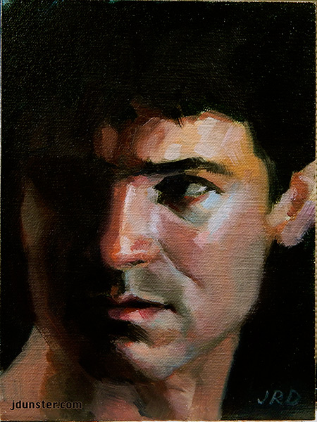
Another in my series of paintings exploring human expression and emotion, inspired by those melodramatic Spanish-language soap operas. (So much crying and angst! So over-the-top! So campy! I love this stuff!) Other paintings in this series are “Sad Tears,”  “Sideway Glance, and Roger.”

I started working on this series because I needed the practice (an interesting excuse to paint little portrait studies) and I thought the challenge of trying to capture the expressions was a needed exercise. Plus I love those Spanish soaps! I started watching them years ago (off and on) and they really have helped with my Spanish comprehension.

“Suspicion” oil on oil-primed linen, 8×8 inches.

I used SourceTek‘s fantastic oil-primed linen. Oh my word, I can’t say enough about SourceTek. When I put the first brushstrokes down on an oil-primed SourceTek panel, I stopped and went, “Whoa!” Kind of like if I’d eaten an especially luscious piece of chocolate. It was that sublime. You just had to be there. The way it took the paint, the texture . . . *sigh* Seriously, I’m in love with these panels. I’ve also got a nice little order of oil-primed linen from RayMar, and I anticipate a similar reaction.

I use good quality paints of various brands. Some of them standard quality “artist grade” (like Winsor & Newton’s Artist Oils and Grumbacher’s Pre-Tested) but I also have some heady, high-end super-duper fancy oil paints. Like Vasari. Sigh and say it with me . . . Vasari.

Vasari is super rich, super smooth, and super-expensive. I had Yellow Ochre (a cheaper pigment) on my palette when I worked on this painting. Other colors (from less expensive brands) were Alizarin Crimson (Permanent variety), Cadmium Red Light, Ultramarine Blue, Prussian Blue, Red Iron Oxide, Naples Yellow, Burnt Carmine (Rembrandt brand—I LOVE this color!), and a Titanium-Zinc White.

Some day I’ll devote a whole blog post to some of my favorite paint brands, as well as more about the colors I like best. But not in this post.

This painting was started several months ago, was shelved as I got sidetracked with other things, and then I returned to it. There was some fussing and fiddling that went into it (getting the proportions of the head correct took a little longer than it should have) but finally I think it’s done. I feel like the painting style here harks back a little bit too much to my illustration roots (I studied illustration in art school) but that’s okay. I’m simply glad to have it done. Onto the next painting!