This is a blissful-looking kitty! I found the expression irresistible and wanted to capture it in a painting. I loved how many different colors were in the cat’s fur—some green, blue, and orange flecks and reflections are found all over. Continue reading “Content Tabby”→
I’ve got a few new cat head paintings to post, but first, the latest news:
“Pale Orange Cat,” 5″ x 7″ oil on Pintura Painting Panel
Another painting completed tonight! This time, I finished this little painting at a most unusual working space: my computer desk!
As I mentioned in a previous post, these are desperate times for me (studio-wise) because now I am fulfilling my duties as a part-time caregiver for a family member. Gone are the days when I can gallivant away to my lovely studio and paint until the wee hours. I must stay homebound and be a caregiver. (And that’s okay. It’s family, after all!) I finally developed a workaround (a small studio area) to allow me to work in a very cramped space, but tonight, I decided to go even smaller.
I hope that my situation (and my solution for it) might be useful for other artists out there. Surely I’m not the only one who is dealing with a desperate need to paint, but only with cramped spaces available to work!
As a follow-up to yesterday’s post, I thought I’d add a little more information about my itty-bitty, microscopic studio “area.” Perhaps all the information I share here will help someone else set up a small studio too.
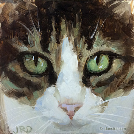
Cat Head work in progress, on its “easel,” a Guerilla Painter Thumb Box (5×7″).
I only have a super-cramped area in which to work. I use overhead light as my light source. (So far, so good.) Right now all I’ve been working on are smaller paintings that can fit in the “easel” part of my small Pocket Box (maximum size, 5×7″). Very soon I’ll be using another table easel type thing that should accommodate slightly larger panels (hopefully up to at least 12×12″).
A wider view of the whole “studio” area, crammed onto a small foldable table.
“Profile in Blue,” 6×6″ oil on panel. Thanks to Dailiaa of dA for the photo I used as reference.
It’s been a frustrating few weeks, with not enough opportunity to paint, and a propensity for procrastination even when there was some time to paint. There’s no excuse for this! But, thankfully in the last few days, I’ve carved out more time for art.
I started this painting about a week ago, and while I initially planned for it to be finished reasonably quickly (they call it “Daily Painting” for a reason), that’s not what happened. I fussed with this, and corrected that, and finally I have decided that enough is enough.
My web stats tell me that my page “A word about student paint” gets plenty of visitors. I think there’s a lot of curiosity about which products to buy, which ones are “best,” and which are rip-offs.
Well, before I start giving my opinions, bear in mind that it is just, like, my opinion, man. But, I think most of what I say here will be not too far off the beaten path, or in other words, will not conflict too much with popular opinion.
A small portion of my paint collection.
SUMMARY OF STUDENT VS. ARTIST GRADE OIL PAINTS:
You’ll see “Student” paint sold alongside “Artist” grade paint, but at a lower price. For instance, Winsor & Newton’s Artist and Student line are as follows: Winsor & Newton Artist Oil Color and Winton. Winton is the student grade. Maimeri Puro is (one of the) artist grade brands from Maimeri, while Classico is their student grade (though actually Classico isn’t that bad). Some brands (like Blockx or Old Holland) only sell artist grade. Other brands (like Soho, sold through Jerry’s Artarama) are only student grade. (And Soho is very low-end, by the way. Just saying.) Continue reading “About Student vs. Artist Grade Oil Paints—Products & Brands”→
This lovely kitty was painted in one sitting, which is a little unusual for me. Or perhaps this is my “new normal”? I had a 5×5″ piece of Gessobord and it needed to be used. Continue reading “Big Ears (Cat Head)”→
“Windswept,” 8×8″ oil on linen panel. Thanks to BirdsistersStock on dA for the stock photo used as reference!
I liked the expression on this model, and the colors in the skin, so thought it would be an interesting study!
The color scheme in this painting seemed to be predominately green, and peach. I like this color combo and had a lot of fun mixing the colors. Continue reading “Windswept”→
“Jon Erik Hexum” ink on paper, approx, 9×12″. Drawn many years ago, using my trusty Rapidographs.
I loved Rapidographs at art school. I didn’t “get” pen and ink at first, always having worked in pencil when I was a teenager and before going to Otis. But they were really stressing ink in the Illustration classes, so I wanted to learn. Continue reading “Blast from the past—Rapidographs!”→