Using a Kindle Fire tablet for drawing reference (Work in Progress pencil sketch). Click on picture to see larger version. (Reference photo is from posespace.com.)
I thought I’d write a little bit about a common tool used by artists: A digital tablet.
Many artists report that tablets are superior for displaying reference photos. Tablets are not limited by the resolution of a print on paper. You can zoom in on an image to see far more detail. The colors are often more accurate and with a wider range. Continue reading “Working with a tablet; FABULOUSLY ORANGE cat head”→
My web stats tell me that my page “A word about student paint” gets plenty of visitors. I think there’s a lot of curiosity about which products to buy, which ones are “best,” and which are rip-offs.
Well, before I start giving my opinions, bear in mind that it is just, like, my opinion, man. But, I think most of what I say here will be not too far off the beaten path, or in other words, will not conflict too much with popular opinion.
A small portion of my paint collection.
SUMMARY OF STUDENT VS. ARTIST GRADE OIL PAINTS:
You’ll see “Student” paint sold alongside “Artist” grade paint, but at a lower price. For instance, Winsor & Newton’s Artist and Student line are as follows: Winsor & Newton Artist Oil Color and Winton. Winton is the student grade. Maimeri Puro is (one of the) artist grade brands from Maimeri, while Classico is their student grade (though actually Classico isn’t that bad). Some brands (like Blockx or Old Holland) only sell artist grade. Other brands (like Soho, sold through Jerry’s Artarama) are only student grade. (And Soho is very low-end, by the way. Just saying.) Continue reading “About Student vs. Artist Grade Oil Paints—Products & Brands”→
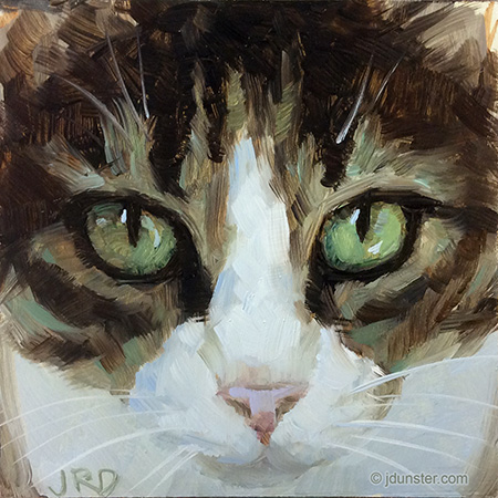
After a regrettably long hiatus, I am back with a new cat head painting! And for the New Year!
Circumstances in life prevented me from getting into my studio to paint for the past several months. I tried to compensate for that by doing some drawings at home. (More on that later.) But now I am back, and am working on some new paintings! This little cat head is the first to be completed. I especially was trying to capture the fluffiness of this kitty with soft brush strokes and lost edges. Also, warm and cool temperatures were used to show depth (I hope).
With this painting I also attempted to go looser! It was fun!
Words cannot express how much I missed painting, and how WONDERFUL it felt to be back to it!
But, I did do some fun pencil work, and below is my latest piece. It probably needs some more tweaking. It’s simple graphite pencil (0.05mm mechanical pencil, HB lead) on smooth paper.
“Untitled” (so far), pencil on paper, approximately 6×7″. Probably still needs some tweaks.
Natalie is an artist friend. She and her husband (another artist, coincidentally!) agreed to model for me. I’ve taken a series of photos and plan to use them as the basis for some paintings. Continue reading “Natalie”→
This lovely kitty was painted in one sitting, which is a little unusual for me. Or perhaps this is my “new normal”? I had a 5×5″ piece of Gessobord and it needed to be used. Continue reading “Big Ears (Cat Head)”→
“Windswept,” 8×8″ oil on linen panel. Thanks to BirdsistersStock on dA for the stock photo used as reference!
I liked the expression on this model, and the colors in the skin, so thought it would be an interesting study!
The color scheme in this painting seemed to be predominately green, and peach. I like this color combo and had a lot of fun mixing the colors. Continue reading “Windswept”→
I don’t do many still lifes, so it was a big treat to be able to do this little painting. It was done as a class project with my student. We were supposed to paint an apple, but I forgot the apple. (I’m so prepared.) Continue reading “Studio Teapot, & more awards (WUT?!?!)”→
I’ve been picking at this painting, nursing it along, and there comes a point where it has to be DONE. I think there might be a few dabs here and there I might add… but not now! Not today! Not tomorrow! I can’t take it anymore!
A recent effort! Jabba the Cat was done as a class project, for an oil painting student I’m currently teaching. We wanted to tackle the many different values and colors in a white animal–where are the values (lights and darks) the lightest? How light? How dark? Continue reading “Jabba the Cat, and the Clague workshop”→