“Big Green Eyes – Cat Head” 6×8″ oil on linen panel. Thanks to hiddenyume-stock for the photo I used as reference!“Intense Kitty Head” 6×6″ oil on panel. Thanks to FurLined for the stock photo used as reference!
I’m doubling up on the cat heads for this post. Lots of cat head painting going on. I’ve been enjoying it very much!
While it might not be evident by looking at the paintings, I was trying a looser hand with both of these pieces. I often used a bigger brush through most of the painting process. One of my teachers, Adam Clague, imparts the wisdom to use a paintbrush that “seems too large,” because that’s just the right size. I think he’s on to something! 😉
Though I did get into the details a lot too (which I don’t think is necessarily bad) I think that “less is more” and I don’t want to paint every little molecule of detail. Some artists do that exceedingly well and beautifully, but it just isn’t the direction I’m heading in.
I also enjoyed capturing the various colors observed in these kitty heads. Who knew that a simple white ruff on a cat’s chest could contain so much color? It truly is amazing. I do so love painting these kitties!
“Ivory Skin & Black Lace” 12×12″ oil on panel. Thanks to La Esmeralda Stock on dA for the reference photo I used as inspiration!
My latest effort. This was done on the “Artist” panel by Ampersand. A good panel, classified as “budget,” but also still archival. I have a lot of these panels. It has a dovetail slot in the back, so it can be hung as-is on the wall, or slapped in a frame. I love the dovetail slot feature, which is why I’ve stockpiled a lot of these boards. They are about 3/8″ to 1/2″ thick (I think 3/8″) and the sides of the panel are painted a complementary color, so if they are hung unframed, the edges of the board look finished (somewhat reminiscent of “gallery wrap” canvases, which can also be left unframed).
I enjoyed this painting and think the model is very striking. She’s great fun to paint. So dramatic! Her skin is so pale and light, I confess I had trouble capturing that adequately with my color mixing. I think I made her a bit more “pink” than she was in the reference photo, but hopefully she’s not too ruddy or flushed. (All monitors are calibrated differently, but on my computer display, she doesn’t look too red-skinned.)
“Splotchy Kitty Head” 5×5″ oil on Gessobord. Thanks to Nikkayla on DeviantArt for the stock photo I used as reference!
Another month, and some new works! Yes, there has been a lapse of paintings for this blog. It was a busy few weeks. But I’ve still been hard at work, painting!
This cat head painting was a particular challenge, because of all the . . . splotches. Our family calls calico/tortoiseshell kitties “splotched” kitties, because of all the multitude of colors. Well, actually my dad called these type of cats “multi-color.” We can’t just call them “calicos,” now can we? 😉
The challenge in this painting was representing the splotches on the surface of the cat, while still representing the form and dimension. I hope I succeeded in that. It certainly did make me think, as I painted!
In addition, here’s a work in progress painting. Hopefully it’ll be done in a day or two. Not much to say yet about this one, other than I’ve enjoyed the drama drama drama of the pose!
WORK IN PROGRESS. “Ivory Skin 2″ (temporary title), 12×12” oil on panel. Thanks to La Esmaralda Stock of DeviantArt for the reference photo used as inspiration.
This is a bit of an experiment, something I’ve been meaning to do for a while.
I didn’t use a model or a reference photo for this painting, but instead made it up completely from my imagination. While this portrait is not that unique (I make up faces all the time, for fun), it’s not typical for me to do what I did with the color on this one. Instead of simply inventing the flesh tones, the lights, darks, pinks, greens, warms, cools, I consulted a photo (with a different pose, with a different person) just to “get” the color. Not sure I was completely successful, but I think it’s a worthy exercise and made me really think.
After studying with Adam Clague, I am taught to look for the warms and cools on an object, as well as value, and what color is it (blue? green? magenta? orange?). One of the “rules” is that if you have cool lights, you have warm shadow. If you have warm lights, you have cool shadows.
I applied this rule (as best as I could) and so this portrait has cool lights (flesh tones with a more magenta tint are “cooler” than flesh tones with a yellowish tint) and warm shadows (I used a lot of Transparent Red Oxide in the shadows). While this portrait is just getting me started, it was gratifying and fun to do it.
The title “Pretty Boy” refers to my penchant to draw pretty people when I am inventing faces. I guess this harks back to my childhood, and all the handsome TV heros I grew up with, and sketched in my sketchbook.
EDIT: Ah, such is the life of an artist. A crazy, crazy artist. I pulled an “all-nighter” in my studio and tweaked this painting. And tweaked it. (And constantly updated this page with a picture of each new tweak.) I’m not saying it’s better or worse now, just “different.” Oh boy.
“Orange Kitty Head,” 5×5″ oil on textured panel. Thanks to Lumibear on dA for the stock photo used as inspiration!
Another cat head! A supremely orange kitty! Look at those blue eyes. Orange cats are so fun to paint. I love their coloring. Alas, this is not a portrait of my kitty, since my orange kitties (embarrassed to admit that I must use the plural of “orange kitty”) are grumpy or too pale. Oh, who am I kidding? I will paint my own orange kitties in due time. They must earn their keep, right?
This kitty is a mighty fine orange kitty, with beautiful markings and vibrant color. A joy to paint.
This is a 5×5″ oil sketch done on a nice type of textured gessoed panel. It has a “canvas-esque” type texture, but is just gesso (acrylic ground). The panel is thick-ish (I believe 3/8″ thick) with a dovetail slot in the back (which means you can hang it as-is, or you can stick it in a frame).
“Lady with Hat,” 6×8″ oil on Gessobord. Thanks to swiftsugar of DeviantArt for the stock photo I used as inspiration!
I loved the expression and pose of this one. The original photo that I used as reference had an exaggerated “golden” tint to it, which I didn’t want to paint. So I ran the photo through my iPad photo editing app (not iPhoto) and chose an option that took away a lot of the yellow. Then I used the adjusted photo as my reference. It was an interesting little iPad tweak!
There were a lot of golds, greens, and muted oranges in this one. A different color scheme, but a lot of fun to paint! She has a very vintage look to her, her expression and the way her head is tilted.
I enjoyed painting this one, and now it’s time for the next!
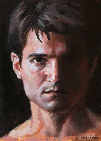
“Jason in Shadow” 5×7″ oil on Gessobord. Thanks to Jason Aaron Baca (model) and Portia Shao (photographer) for the stock photo I used as reference.
I classify this as oils, but to be more specific, I used fast-drying oils (alkyds) on this painting. They are one particular flavor of oils and have been around for a while. (Read more rambling from me about them on this post.)
I’m a big fan of Jason Aaron Baca’s stock photos on DeviantArt. So much drama! Dramatic poses, dramatic lighting, what’s not to love? So here’s another little oil sketch based on one of his photos.
With this painting I was working again with trying to capture the light and shadow, and of great interest to me, the warms and cools. He had a lot of cool tones in the highlighted parts of his face. I’m also working on making more pronounced brushstrokes, more strong and visible. I love bold brushwork and want to get more proficient with that! So exciting!
So, another one done. Put a fork in it! Now onto the next oil sketch. I have several in the works!
I forgot to post this painting earlier. It was completed in August. I loved the intense look on the model’s face, but when I compare my finished piece with the stock photo used as reference, I realize that it ended up being more “inspiration” than a literal reference. I changed the expression, the intensity, the contrast, a lot of things. Now don’t get me wrong, it’s still obviously painted from that particular photo, but the jawline, the shape of the head, and the tilt of the head, among other things, were all changed. I don’t consider it a good likeness of the model anymore. But I have no intention of changing it.
What attracted me to this particular stock photo was the expression of the model, as well as all the variety of colors in his face—the pinks, neutral greens, and even some pale lavenders. It was a challenge trying to capture all of that in the painting. Not sure I succeeded completely, but I tried!
I used Ampersand Gessobord this time, which has a luscious, smooth, eggshell-like surface. I love it. I don’t always want to paint on that type of surface, but it is one of my favorites. It works especially well with smaller works.
I’m going to add a brief entry to my “tutorials” section. It’s not much, but I feel badly that I haven’t been updating the blog as frequently. (It’s summer, what can I say? I went on another road trip last week.)
I’ve dabbled in alkyds (fast-drying oils) for a long time now. I first tried it in art school, many moons ago. I think that at the time we only had Winsor & Newton brand. The first impression I had of alkyds (back then) was that they weren’t as opaque as regular oils, and they had a kind of “waxy” texture. But they were quite workable, and I loved the fast drying time!
“Jason in Shadow,” 5×7″ alkyd on Gessobord. Thanks to Jason Aaron Baca (model) and Portia Shao (photographer) for the use of the stock reference photo.
Here’s an alkyd study I did recently. Now we have several brands of alkyds to choose from, and they don’t seem as “waxy” as they used to, way back. But they are still quick-drying!
I typically use Liquin (an alkyd medium) when I paint in alkyds. This should help speed drying time more. I find that usually in less than a day (depending on the paint thickness) the painting is dry enough, and ready to be worked on again.
Here’s another recent alkyd painting (WORK IN PROGRESS!).
“Blue Hair,” 12×12″ oil (alkyds) on canvas panel. WORK IN PROGRESS!!!! Thanks to Cathleen Tarawhiti on DeviantArt for the stock photo I used as reference.
With “Blue Hair,” the painting was dry to the touch later the same day, so I was able to do some work in the morning/noonish, and do a little more later on in the day. Amazing! I love my alkyds.
Even though we have several brands of alkyds to choose from (as opposed to just W&N’s alkyds, back in the day), I wish there were even more brands and colors available. Winsor & Newton’s “Griffin” brand has recently discontinued all cadmium colors. I understand that they have probably made this decision because cadmiums have some toxicity, but cadmium “hues” aren’t the same—cadmiums have an opacity and denseness that cannot be replicated in “hues.” Fortunately, the other alkyd brands (C.A.S., DaVinci, and Gamblin) do still carry cadmiums.
Each brand of alkyd has their own properties. I think DaVincis tend to be very thick and stiff. (Kind of like Old Holland in that respect.) I will still use them, am very grateful for DaVinci’s line of alkyds, but given a choice, I prefer something a little more buttery. Gamblin’s “FastMatte” alkyds are pretty good, soft and buttery, though I wish they carried more colors. CAS is a good quality brand, but sometimes their customer service sucks if you order from their site. (Long, long story there. For another time!) Griffins have a good consistency and I think a decent pigment load, but I miss the cadmium colors.
Alkyds have, in some form or another, been around for many decades. I’ve heard that studies indicate that they are “stable” and I am comfortable using them. My old paintings done in art school still seem rich and vibrant as ever. As long as we use pigments that are strong and light-fast, I think they’re an awesome alternative to regular oils. In fact, it’s perfectly acceptable to mix alkyds with regular oils. (Many artists use an alkyd white with their regular oils, which tends to speed up drying time on all the paints.) Some manufacturers of regular oils sell a “fast drying” white, which is often made with alkyds, for artists who enjoy the fast-drying properties of alkyds but don’t want to use a whole set of alkyd colors.
My absence from this blog should not be interpreted to mean that I haven’t been painting! I’ve got several new works lined up, as well as other things, art-related, going on.
“Apple” 6×8″ oil on panel. Painted from life.
This was painted a few days ago, from a simple still life setup at my studio. I painted with fellow artist Diane, who has previously worked mostly from acrylics and wants to get into oils. Continue reading “An Apple, and Alkyds”→